Feb 15th, 2020
Creating Illustrations With Grain in Photoshop
Learning to use Photoshop and simple brushes to create fun, warm, and lively illustrations with grain based shadows. From pencil sketches to 3D illustrations.
I’ve always been an artist - drawing sketchs in my free time; making canvas paintings; learning digital software for 3D design, digital paintings, digital drawings, and general graphic design. The one thing I always struggled with is lighting and getting a friendly realistic feel to the things I make. Now, for 3D software, I’ve been able to rely on its ray tracing abilities to decide where the light and shadows should be. But what about when we want to create more stylized illustrations that don’t rely on anything but our imagination? For me, I’ve found it easiest to do shadowing with grain in Photoshop.
Getting Started
For me I put this into 3 steps. Below you’ll find my process and how I approach each one:
Sketching
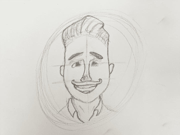
Sketching is the start, a simple drawing with pencil and paper, just something to get the idea (or reference, my brother in this case) out in the form of lines. Make sure it mostly all is looking good and you feel like you’d easily be able to translate this into a bunch of small shapes. It’s not important for everything to be exact, but the closer the better and, for me, the faster it goes once taking it digital.
Blocking
Simply stated, blocking to me is taking your sketch, pulling it into Photoshop and tracing every piece of your illustration into each of its own paths using the pen tool. You make “blocks” that are all seperated out and can be shaded individually.
In this avatar graphic there are about 25 different paths and shapes all blocked out and named. There is the hair, head, neck, shirt and collar (left & right), the pair of ears each with two shapes; There are then all of the components of the face as well (some hidden due to color). The goal is to seperate out any piece you would like to shade soley by itself.
Once you have blocked everything out, you will want to decide your color scheme right now as this can deterime the rest of the look and feel as you go. As you can see above, I colored every part exactly like I wanted. The only case where I may wait is for something like the nose of the avatar. It is exactly the same color as the rest of the head and it may become hard to see and you might be better off just waiting to change the color later.
Shading
Once you’ve blocked everything out and are ready to continue on to shading, you’ll need to pick a brush.
Any grain brush in photoshop will do, although I use the default legacy brushs, specifically the “Airbrush Hard High Density Grainy”. For each illustration I will play around with the size and settings of each brush, but generally I keep the defaults and turn down the “spatter amount” to 75%. Have you’re brush? Now comes the fun part!
From here you need to pick your light source. For this illustration I chose the upper left as this was where the light was coming from in my reference photo. You will want to pick one of your blocks that you feel most comfortable with and create a layer above it, you can then right-click and select “create clipping mask”. This will ensure that the brush is only applied to anything in the layer below it.
Start adding the shadows and highlights
You’ll want to begin adding on to your layer you just created with shadows wherever seems intuitive. Anywhere the light would cast a shadow. When two objects get closer to each other. Or somewhere that is simply on the opposite side of your light source. You will also then do the opposite for the highlights. Some things to keep in mind:
- Shadow layers get a blend mode of “multiply”
- For shadows, use dark or black colors for your brush color
- Highlight layers get a blend mode of “overlay”
- For highlights, use light or white colors for your brush color
- USE OPACITY
Don’t be afraid to use many layers and take your opacity down to almost nothing. I usually will do 2-3 passes for shadows and highlights each: creating a subtle cast with very low opacity, a second pass with a medium stretch across the object, and a third high intensity pass directly on the darkest edge (this one has the highest opacity). Use as many layers as you need!
Simply do this for every block you have, creating masks, overlaying highlights and shadows, and making your best judgement of where the highlights and shadows should fall.
If all looks well, add some details too! Add lines here or there at 5% opacity to just give a slight hint for the mind to fill in!
Inspiration
One of the pieces that really got me going in the first place was a video from Dan Gartman showing off a timelapse video of his process. The process I follow is basically exactly the same as his and I take no credit for mine being unique in any regard, but I simple wanted to write the process down very simply for easy reference for myself or anyone else down the road. If you enjoy this style of artwork, take a look at the video below!


What did you think?